Description
Your popup is set to ‘Responsive Sizes’ under the ‘Display Settings’ pane. It displays well on a desktop screen, yet on small-size screens appears taller than the screen. This can eliminate access to the popup ’Close’ button in the top-right corner, and lead you to think the popup is non-responsive on mobile devices.
Cause
Your popup’s content (the part we have no control over) is taller than a small screen-size. To adjust, the popup container expands vertically around the content.
Your choice of popup anchor position affects the placement of the popup container on screen. On mobile-sized screens, a popup anchored to ‘Middle Center’ will extend lengthy content above and below the screen.
Solution

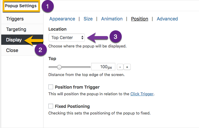
In the Popup Editor:
1) go to the ‘Popup Settings’ box, and
2) select the ‘Display’ option tab. Select the ‘Position’ option category, and
3) change the ‘Location’ option from ‘Middle Center’ to ‘Top Center’.
Now the top of the popup container will be visible on a small screen size. The popup container will move up and down within the browser window, which allows all the popup content to be seen.


