Overview

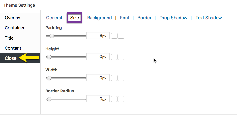
Figure 1 (above). View of the Close >> Size option settings for the Default Theme.
The Close option tab controls the styling of the popup close button. The Size category controls the padding around the close button text, and the amount of rounding (border radius) applied to the corners of the button.
Property Descriptions
- Padding styles the amount of padding between the outer edge of the close button and the text within.
- Height styles the height of the close button
- Width style the width of the close button.
- Border radius styles the amount of curvature (radius) added to the corners of the close button.
Property Default Values Listed by Theme
| Popup Theme | Padding (px) | Height (px) | Width (px) | Border Radius (%) |
| Default Theme | 8 | 0 | 0 | 0 |
| Light Box | 0 | 26 | 26 | 26 |
| Enterprise Blue | 4 | 28 | 28 | 42 |
| Hello Box | 0 | 0 | 0 | 28 |
| Cutting Edge | 0 | 24 | 24 | 21 |
| Framed Border | 0 | 20 | 20 | 21 |
Preview Close Option Settings in the Customizer
When editing the Close button features, use the customizer located to the right of the Theme Settings box to preview your changes.
Select the Update button to save any changes to popup theme settings. Otherwise, any changes will be lost after you leave the page.


