Problem Description
The popup content appears wider than the screen on a mobile device even when a responsive popup size is selected.
Possible Causes
The width of the popup container is greater than the popup width setting AND
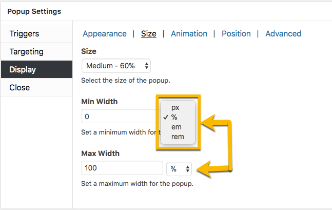
- The maximum width of the popup was set to pixels ( px ) and not percent ( % ), em, or rem;
OR
- The width of the popup was set to a ‘Custom’ size that is greater than the width of the mobile screen. By default, the popup width is set to 640 px when the ‘Custom’ size is selected.
Recommended Solutions

1) Select one of the 8 responsive size settings for your popup. In the Popup Editor, go to:
- Popup Settings (box) >>
- Display (tab) >>
- Size (category) >>
- Size (menu)
to inspect the popup size setting.

2) Check the units assigned to the popup. Change the width units from pixels ( px ) to percent ( % ) to allow the popup to resize inside the screen.
Review the following related article to learn about the ‘Display’ option settings in the popup editor Popup Settings box.
Related article: ‘Display’ option settings
3) If the problem is not corrected by the plugin settings, the issue may be caused by the CSS applied by either your site theme or another plugin.
Use your browser inspection tools to assess whether your site theme’s CSS allows popup content to display wider than the device screen. See the related articles below for assistance on how to open browser inspection tools, and what to correct in your theme CSS.
Related article: Open Browser Inspection Tools on Your Site
Related article: Finding/Fixing Unintended Body Overflow ( CSS Tricks article )


