Overview

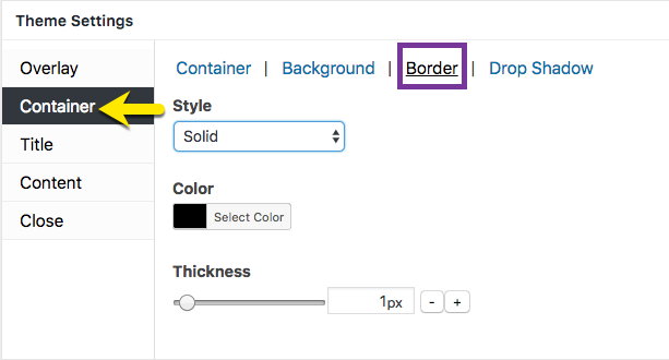
Figure 1 (above). View of the Container >> Border option settings for the Default Theme.
The Container option tab controls the styling for the popup container. This article addresses the Border category which includes the style, color, and thickness properties of the border around the popup container.
Property Descriptions
- Style controls the border pattern applied to the popup container. Options: None, Solid, Dotted, Dashed, Doubled, Groove, Inset (inner shadow), Outset, Ridge.
- Color controls the color applied to the selected border.
- Thickness controls the width applied to the selected border. Range: 1 – 5 ( for all Styles except ‘None’ ).
Property Default Values for Each Popup Theme
| Popup Theme | Style | Color ( name / hex number ) | Thickness (px) |
| Default Theme | None | black / #000000 | 1 |
| Light Box | Solid | black / #000000 | 8 |
| Enterprise Blue | None | white / #ffffff | 1 |
| Hello Box | Solid | green / #81d742 | 14 |
| Cutting Edge | None | black / #000000 | 1 |
| Framed Border | Outset | red / #dd3333 | 20 |
Container Option Settings
How to Edit Settings
- Move the slider horizontally; or
- Change the pixel value directly, or
- Select the ‘- / +’ buttons to increment changes to pixels.
Preview Changes in the Theme Customizer
When editing the Container option styles, use the customizer located to the right of the Theme Settings box to preview your changes.
Select Update to Save Changes
Select the Update button to save any changes to popup theme settings. Otherwise, any changes will be lost after you leave the page.


