Overview

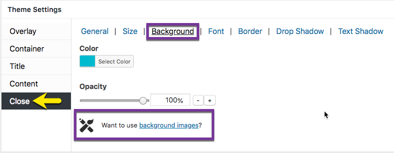
Figure 1 (above). View of the Close >> Background option settings for the Default Theme.
The Close option tab controls the styling of the popup close button. The Background category styles the background color applied to the close button.
Property Descriptions
- Color styles the background color of the close button.
- Opacity styles the density of the applied color. An opacity of 100% is a fully saturated color, while a value of 0% is fully transparent.
Property Default Values Listed by Theme
| Popup Theme | Color ( hex number / name ) | Opacity (%) |
| Default | #00b7cd / blue-green | 100 |
| Light Box | #000000 / black | 100 |
| Enterprise Blue | #315b7c / dark blue | 100 |
| Hello Box | #ffffff / white | 100 |
| Cutting Edge | #eeee22 / yellow | 100 |
| Framed Border | #000000 / black | 55 |
Preview Close Option Settings in the Customizer
When editing the Close button features, use the customizer located to the right of the Theme Settings box to preview your changes.
Select the Update button to save any changes to popup theme settings. Otherwise, any changes will be lost after you leave the page.
Replace the Button Background Color with a Custom Image

The close button background color can be replaced with a custom background image using the Advanced Theme Builder extension to Popup Maker. The plugin requires a paid license which is valid for a term of 1-year. Licensees are eligible to receive support and upgrades during the license term.


